PROJECT SUMMARY
Life is Better Active
Life is Better Active
SITUATION
The Kelly Brush Foundation helps people with spinal cord injuries lead active, engaged lives through grants, adaptive sports equipment, resources, and community.
The Kelly Brush Foundation helps people with spinal cord injuries lead active, engaged lives through grants, adaptive sports equipment, resources, and community.
Founded after Kelly Brush sustained a spinal cord injury during an Alpine ski race, the organization carries forward her determination to keep moving, competing, and living fully.
As the foundation grew, the brand needed to better reflect the energy of its mission: bold, active, optimistic, and built to help more people get back to doing what they love.
SOLUTION
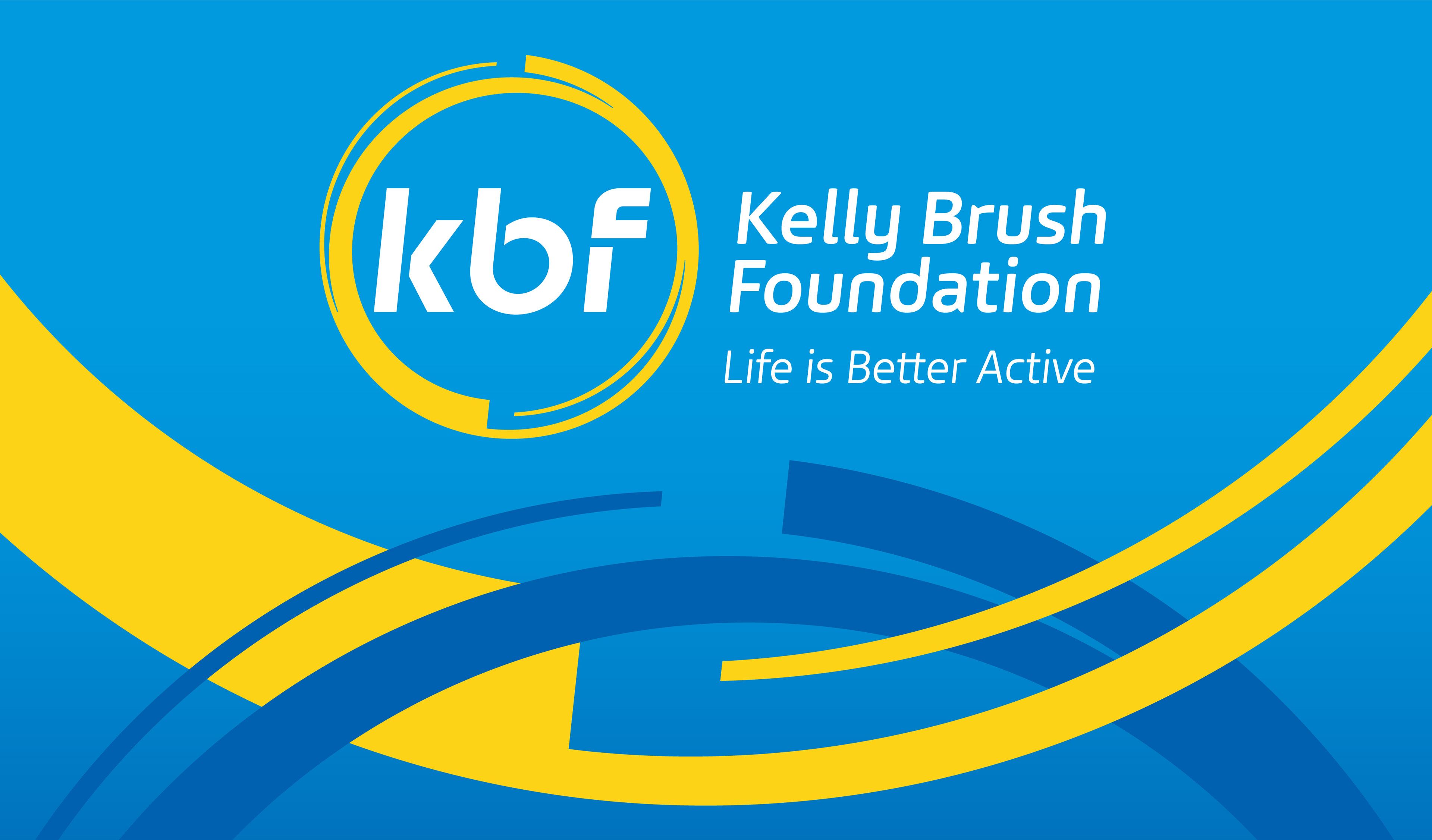
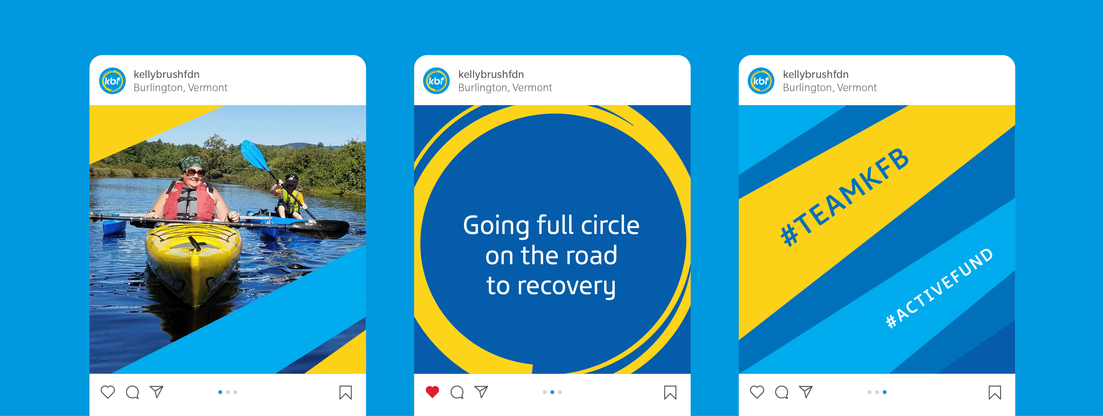
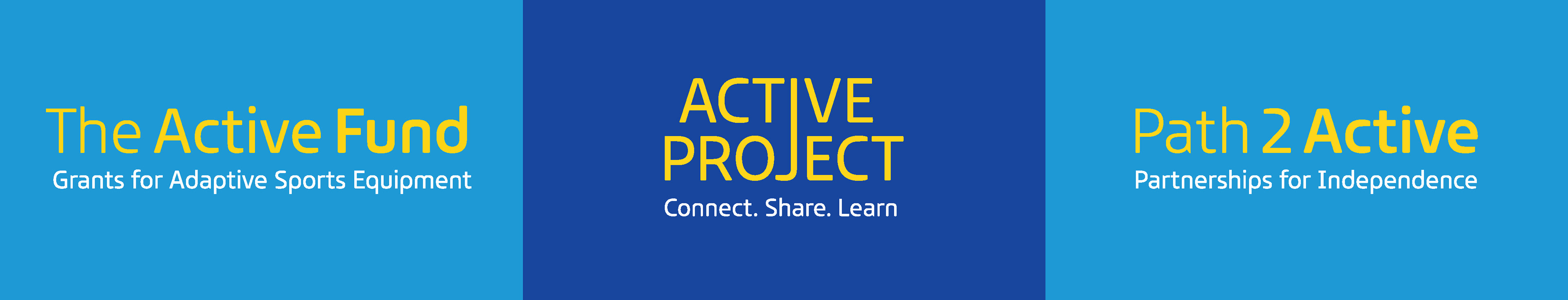
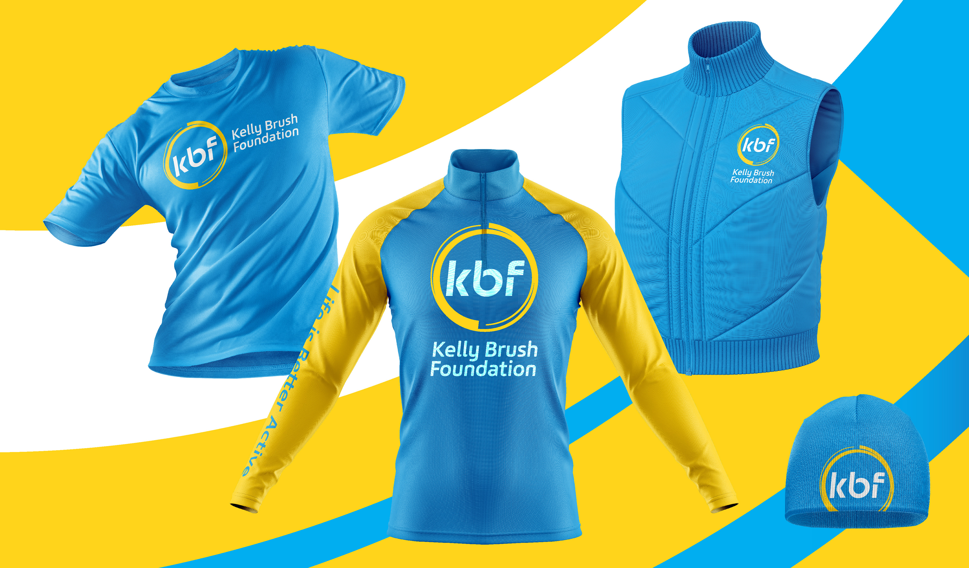
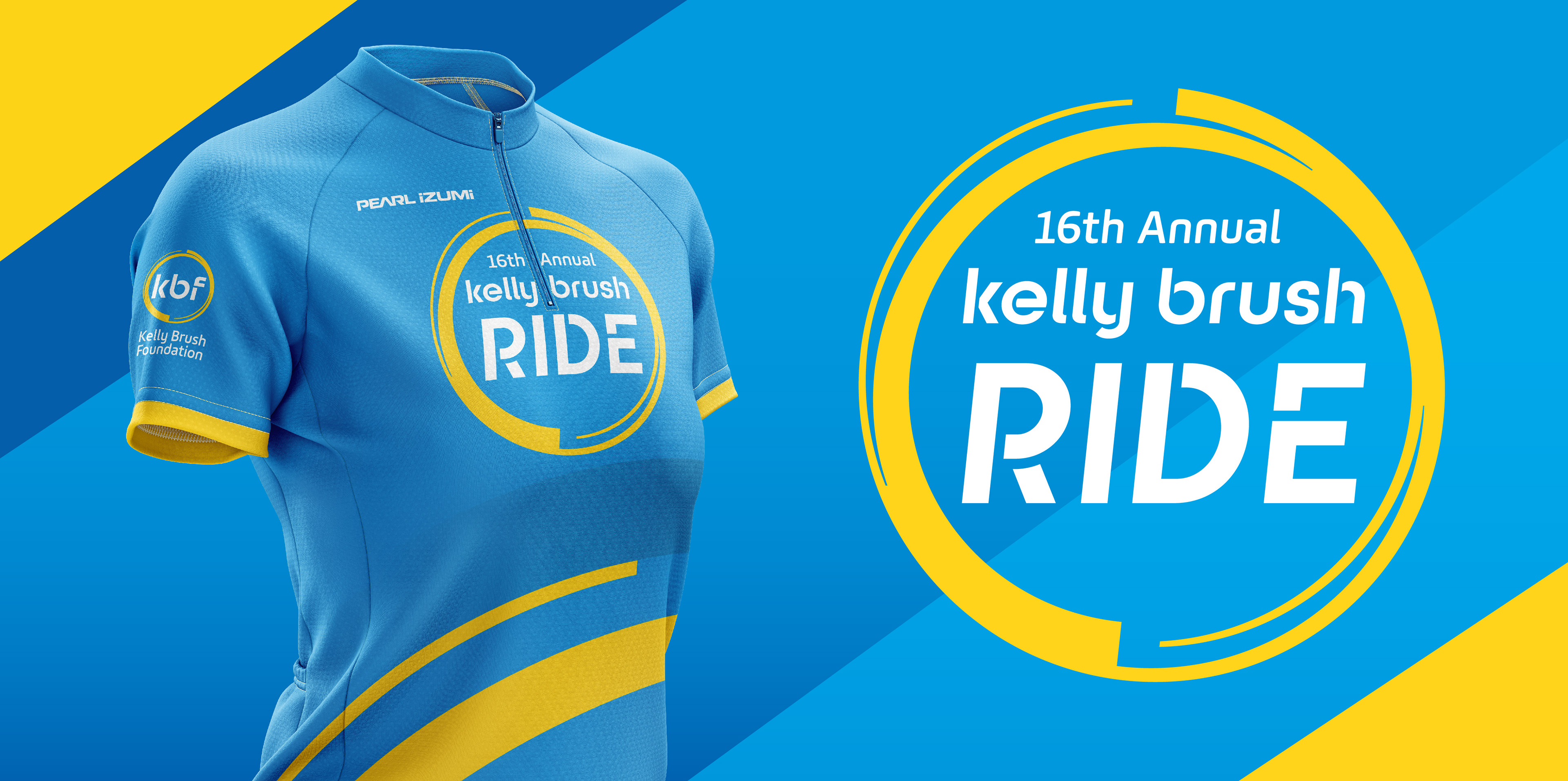
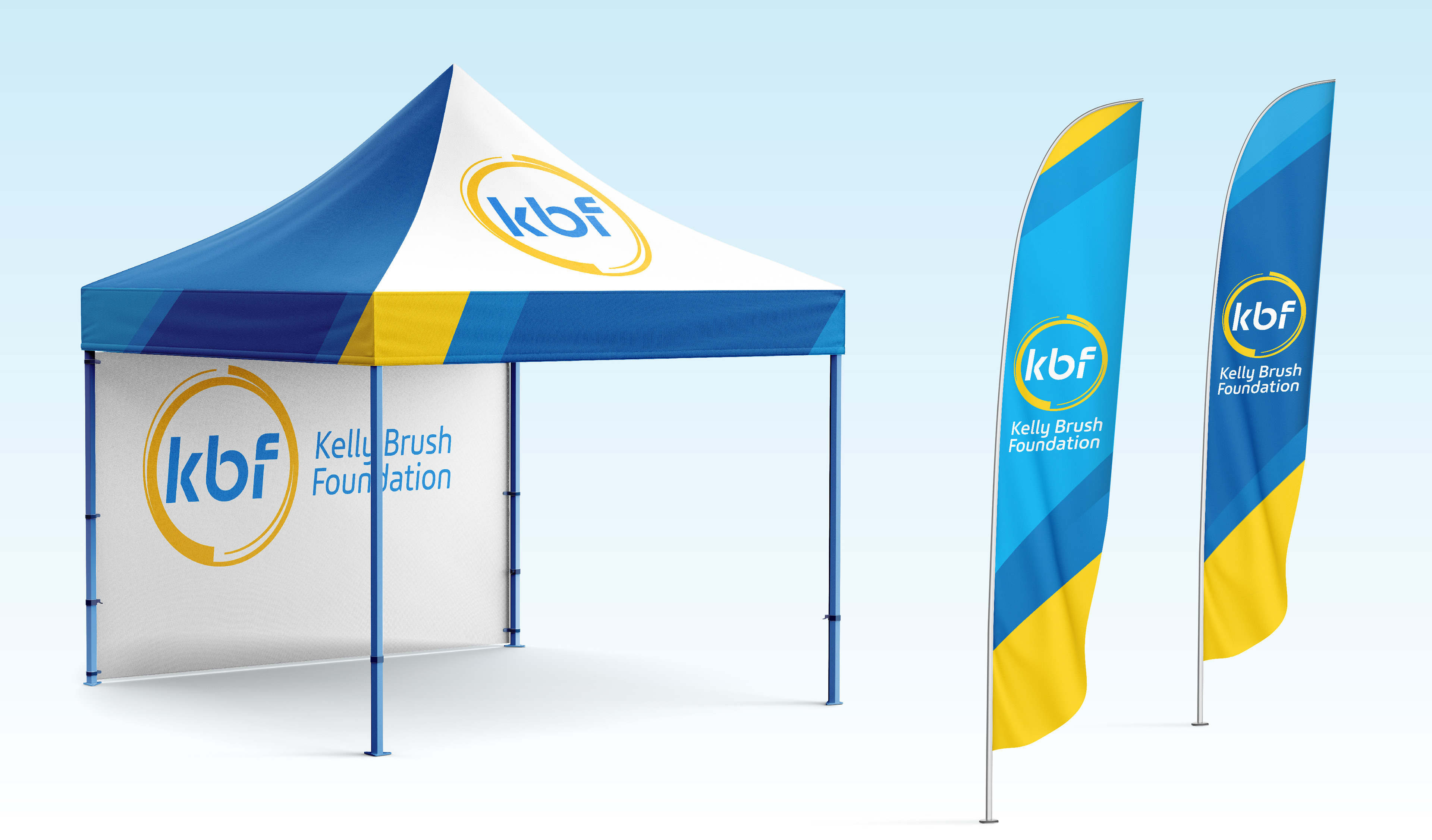
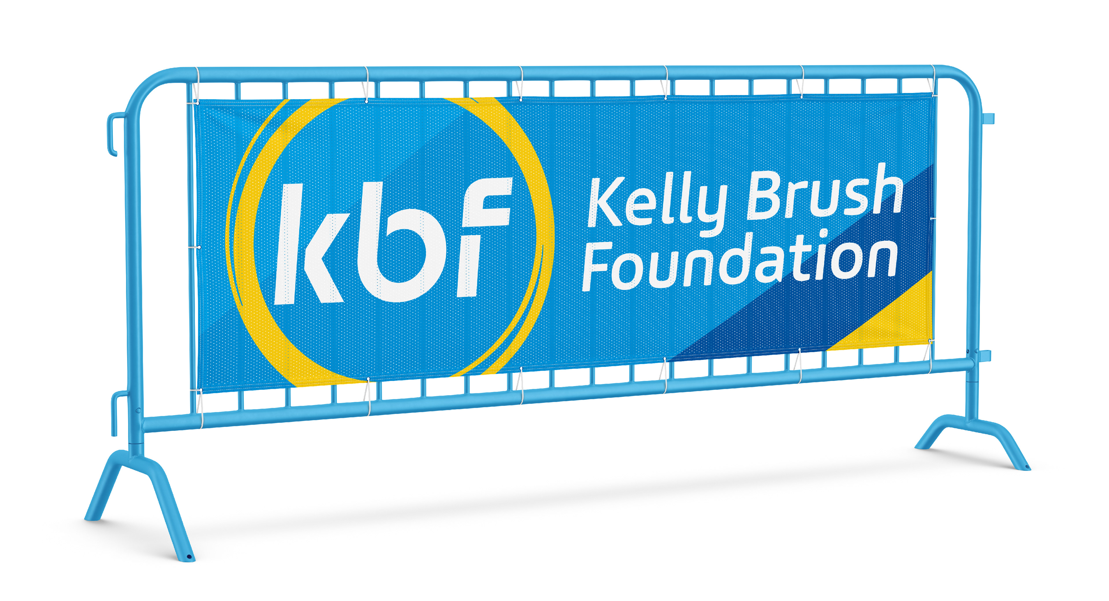
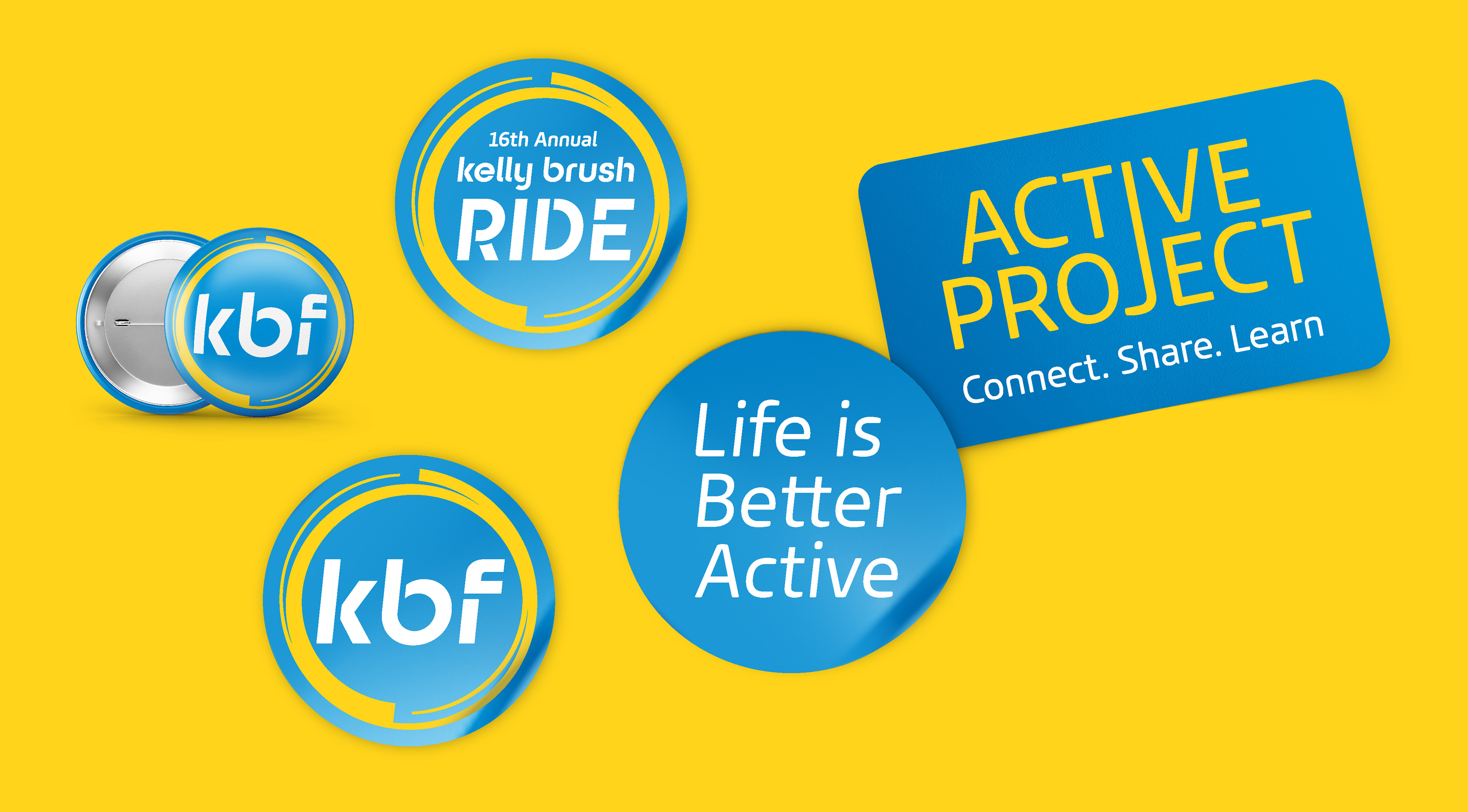
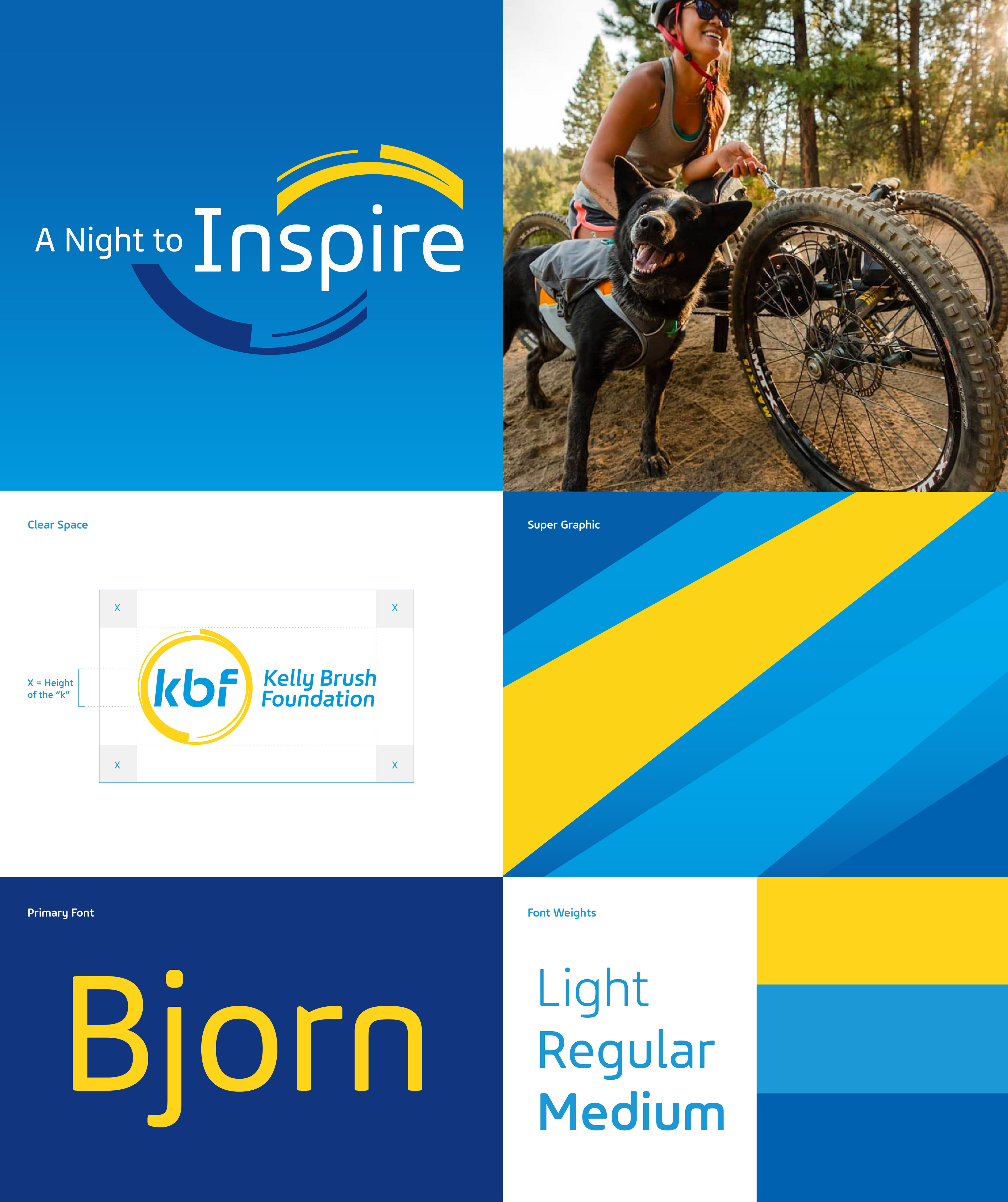
The new look begins with a bright yellow and blue palette in the colors of the sun and sky—the visual embodiment of hope and limitless possibility. The circular symbol surrounding the logotype creates a sense of motion and energy, coming full circle on the path to recovery. The encircled “b” forms the image of a wheelchair, the most basic and empowering of all adaptive sports equipment for those with SCIs.c
The new look begins with a bright yellow and blue palette in the colors of the sun and sky—the visual embodiment of hope and limitless possibility. The circular symbol surrounding the logotype creates a sense of motion and energy, coming full circle on the path to recovery. The encircled “b” forms the image of a wheelchair, the most basic and empowering of all adaptive sports equipment for those with SCIs.c
A secondary circular graphic extends the identity into a more active visual language, suggesting trails, pathways, ski tracks, and forward movement.
The modern typeface adds clarity and energy, giving the brand a more athletic, inclusive presence across events, performance apparel, and communications.
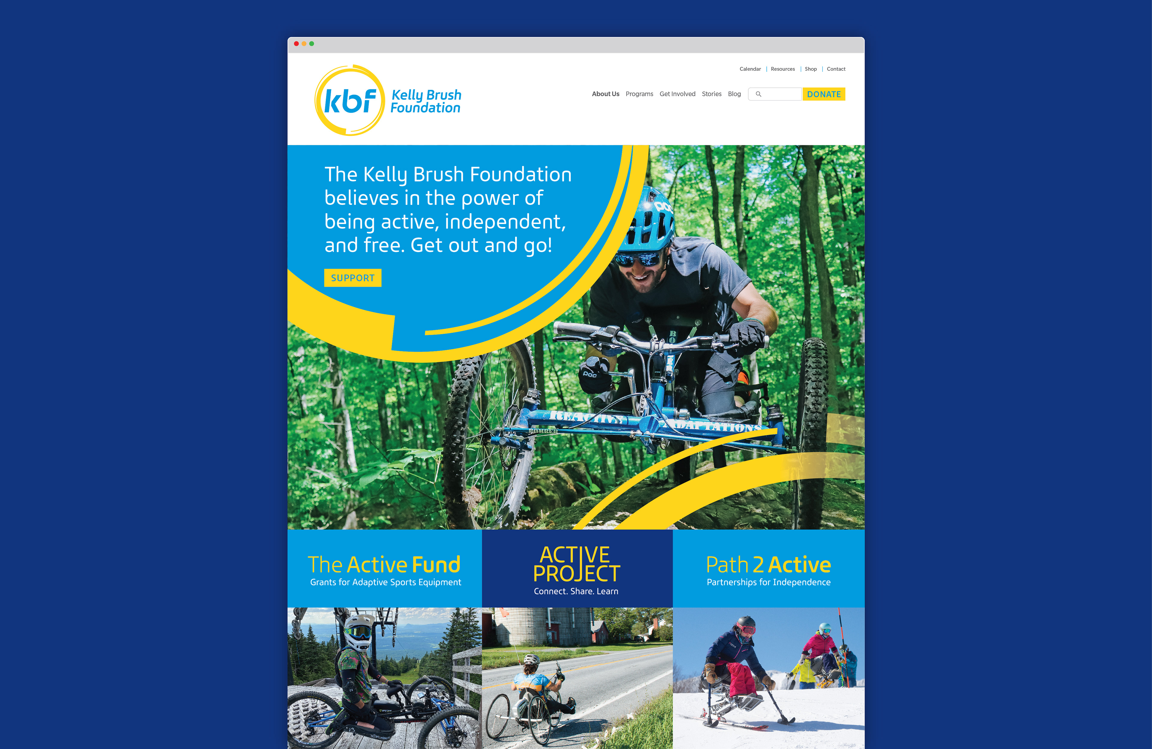
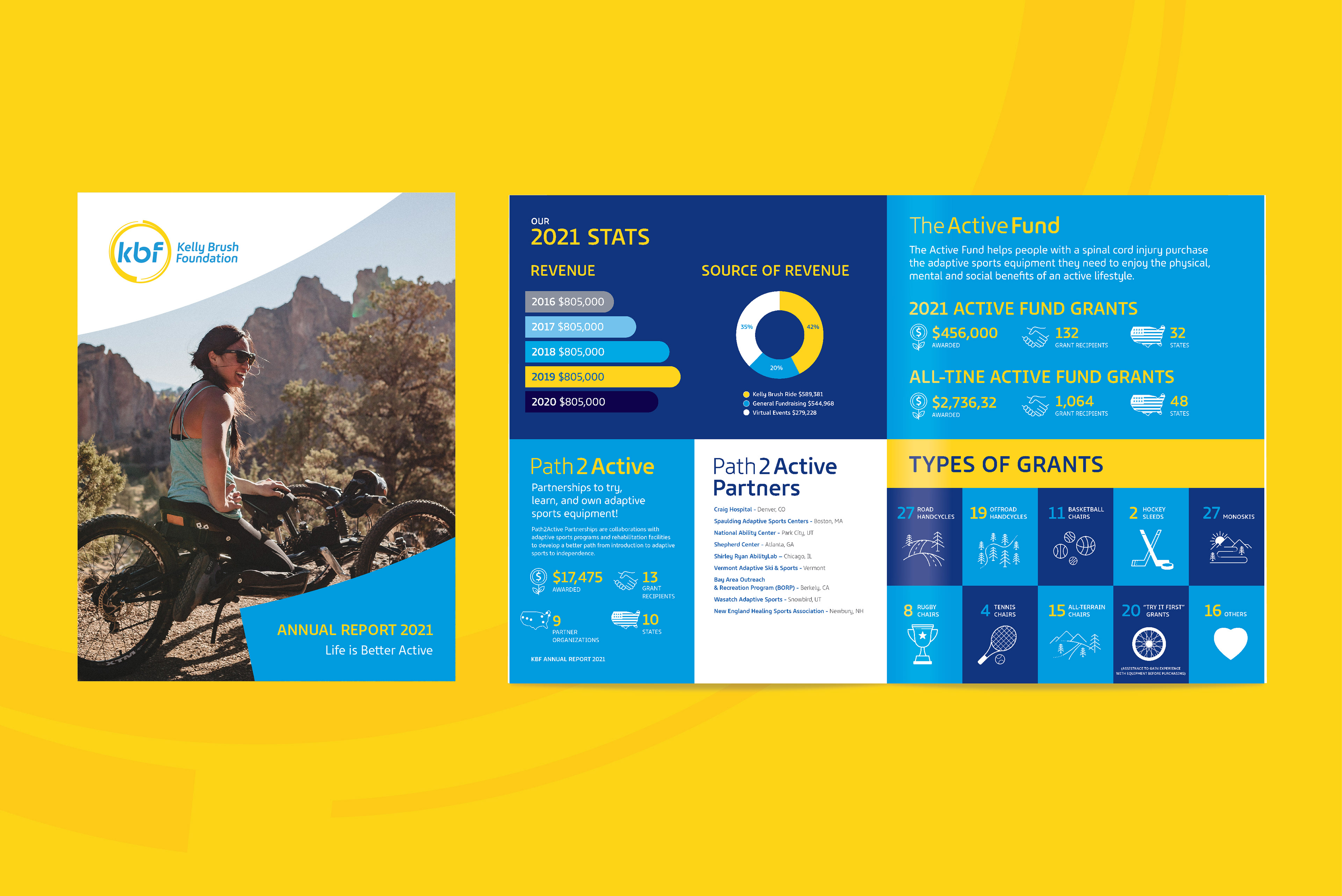
The system was designed to scale across the foundation’s key touchpoints, from event graphics and feather flags to canopies, cycling jerseys, and future campaign materials.
“The work helped us clarify who we are, where we began, and where we are headed.
It captured the spirit, energy, and ambition of our organization, creating a fresh, confident brand that reflects our mission and supports the impact we’re ready to make.”
Edie Perkins, Executive Director
Kelly Brush Foundation
Kelly Brush Foundation
Contact us at info@pencilworx.com